
Full Case Study
Celigo
Celigo Rebrand
Leading an award-winning, in-house rebrand for $100M ARR SaaS company
2024
To support an aggressive move into the enterprise space, Celigo needed a brand that signaled maturity and scale. I led the transformation in-house, spanning brand positioning, visual identity, and the execution of hundreds of global marketing touchpoints. Bypassing the traditional agency model, we compressed a year-long timeline into 5 months and realized $500K+ in direct cost savings. The resulting work earned a Gold ADDY and GDUSA Award, proving high velocity, in-house execution can deliver world class results.
Roles, Tasks
Brand Strategy, Creative Direction, Design, Design System Architecture, Team Leadership, Project Management


The Challenge
Transform Celigo's brand from a perceived point-to-point solution into a differentiated enterprise platform that reflects the company's technical capabilities and human-centered business process expertise—executed entirely in-house with a lean team.
Celigo needed to shed its legacy perception and position itself as an enterprise-wide integration platform capable of competing for major accounts. At $100M ARR, the stakes were high: the brand had to signal technical sophistication, human-centered approach, and enterprise readiness, all while differentiating from the pervasive "Sea of SaaS Sameness."
The challenge extended beyond aesthetics. The rebrand had to be executed within an aggressive timeline of less than 5 months, with limited budget, and handled almost entirely by our small in-house team while maintaining day-to-day creative operations. The only external support would be website development and migration—everything else stayed in-house. Success required strategic efficiency: building on foundational systems I'd implemented during my first year, rapid stakeholder alignment, and empowering the team to solve problems autonomously.
Strategic Approach

An artifact from the early whiteboarding session
The strategic approach balanced four priorities: honoring my predecessor's legacy (evolving his "Morse" dot-and-dash system into dynamic motion graphics), differentiating through humanity (authentic photography vs. corporate stock), signaling enterprise readiness through visual boldness, and future-proofing through the token-based design system I'd built in Figma during year one.
Rather than jumping immediately into a massive system overhaul, I spent my first year at Celigo observing, synthesizing insights and improving foundational systems. When our new CMO started in mid-2023, he immediately signaled rebrand readiness, and I was able to rapidly transform a year's worth of strategic thinking into a comprehensive brand concept that aligned creative vision with business objectives.
Competitive analysis revealed a pervasive "SaaS sameness" of blues, stock photos, and sterile technical positioning. Celigo's differentiator was a human-centered approach: 10 years of business process expertise applied to real customer challenges.
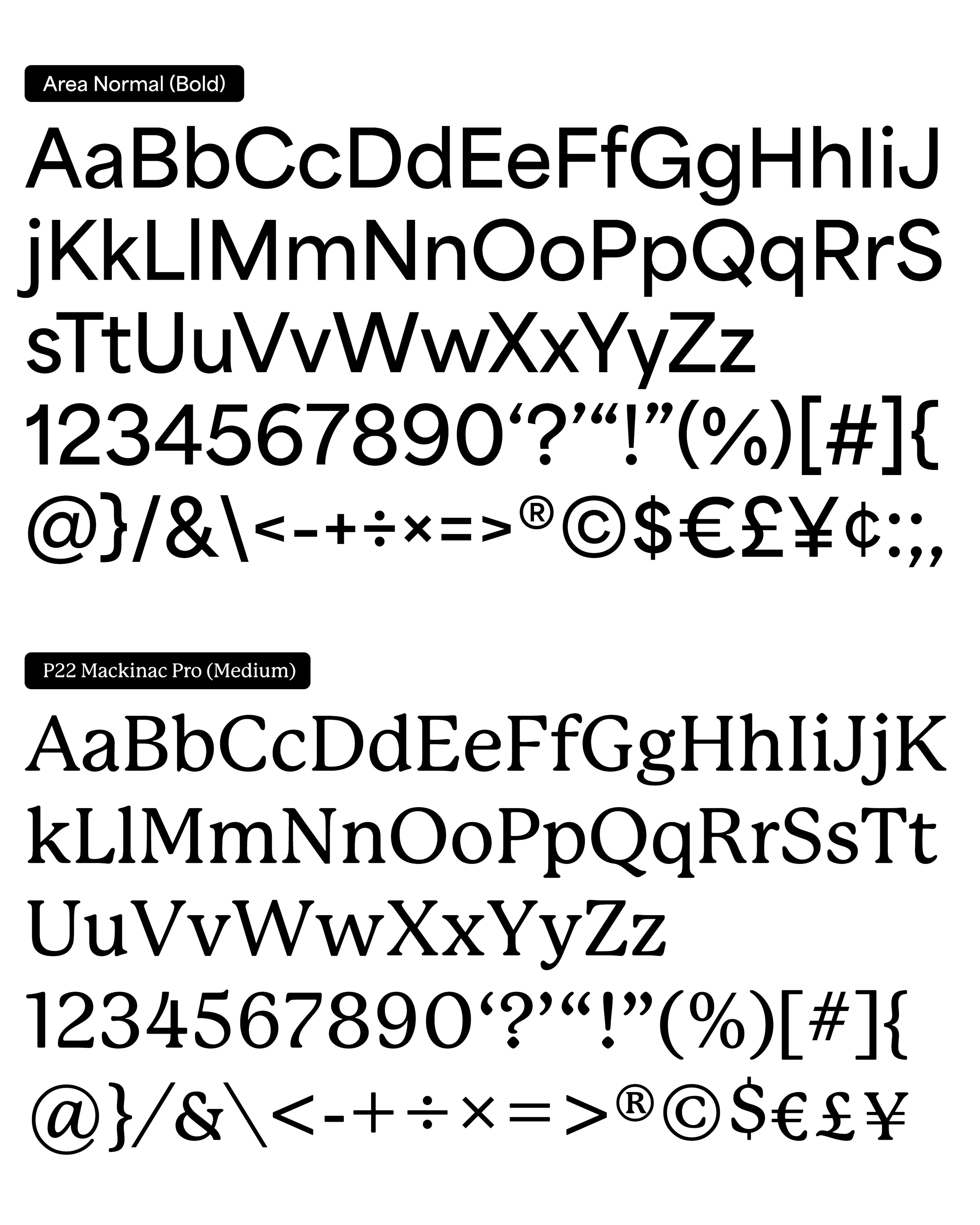
Working closely with our CMO, I developed a visual system that abandoned ubiquitous SaaS blue for a balanced color palette, featured real human moments in our photography, embraced motion to represent data connectivity, and paired geometric precision (Area Normal typeface) with humanist warmth (P22 Mackinac Pro).
Process: The "Mic Drop" moment
One month of focused concept development led to a single presentation that earned immediate executive approval without a single change request, accelerating the timeline by 3-4 months and establishing the strategic direction I would lead through execution.
The rebrand work kicked off in mid-August 2023, with a planning session at our California headquarters led by our CMO. When he, along with our VP of Corporate Marketing, Art Director, and myself, regrouped the next day to begin "mood boarding," I revealed the comprehensive brand concept I'd been developing independently for months—complete with strategic rationale, visual system, typography, photography approach, motion guidelines, and brand narrative.
After presenting, the room went silent. Then, our CMO (previously at NetApp, with decades of experience) said:
"I've been a CMO for a long time and I've seen countless brand presentations in my career. This is the first time I haven't had a single change request. You've absolutely nailed it. Mic drop moment."
We skipped 3-4 months of typical brand development cycles and moved directly to execution. I created a comprehensive project plan in Asana, coordinating 100+ deliverables across multiple workstreams: website redesign with external agency April Six (the only outside support), corporate identity system, internal platform rebrand, branded merchandise, sales collateral, and product design system translation—all managed and executed in-house while maintaining day-to-day creative operations.
With the strategic vision approved, I focused on enabling the team to execute at the velocity required. Rather than attempting to personally touch every deliverable, I educated the team on the strategic intent behind design decisions, building the brand guidelines website myself to serve as both reference and teaching tool. This enablement approach proved critical—team members could solve emerging challenges autonomously, applying the strategic framework to scenarios we hadn't explicitly addressed.


The design philosophy I established centered on balance. Technical precision paired with human warmth, bold statements balanced with judicious restraint, acknowledgement of our brand legacy but with deeper purpose and timely relevance. Every design decision connected back to Celigo's core differentiator: the human expertise behind the technology.
Visual System & Implementation
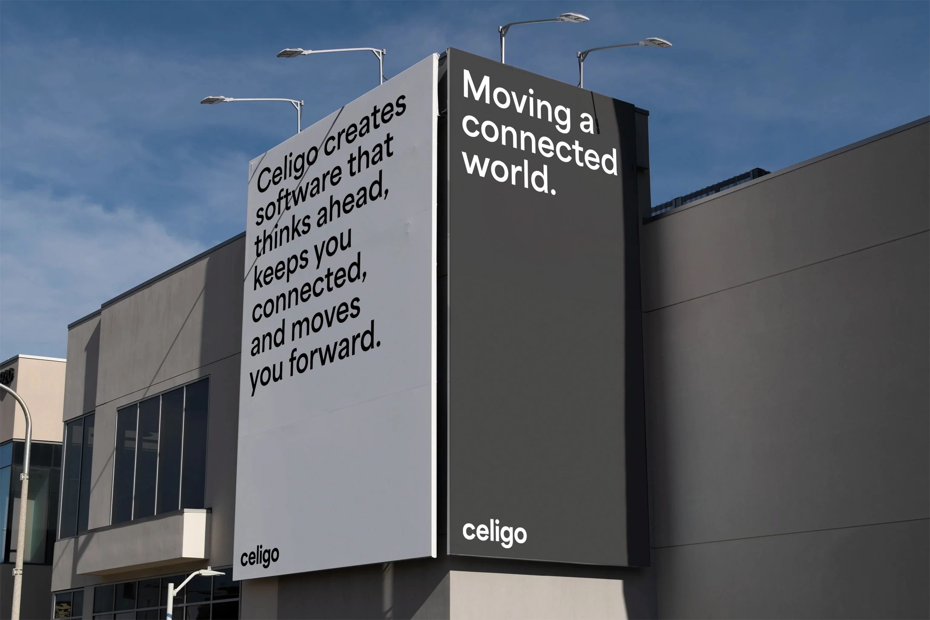
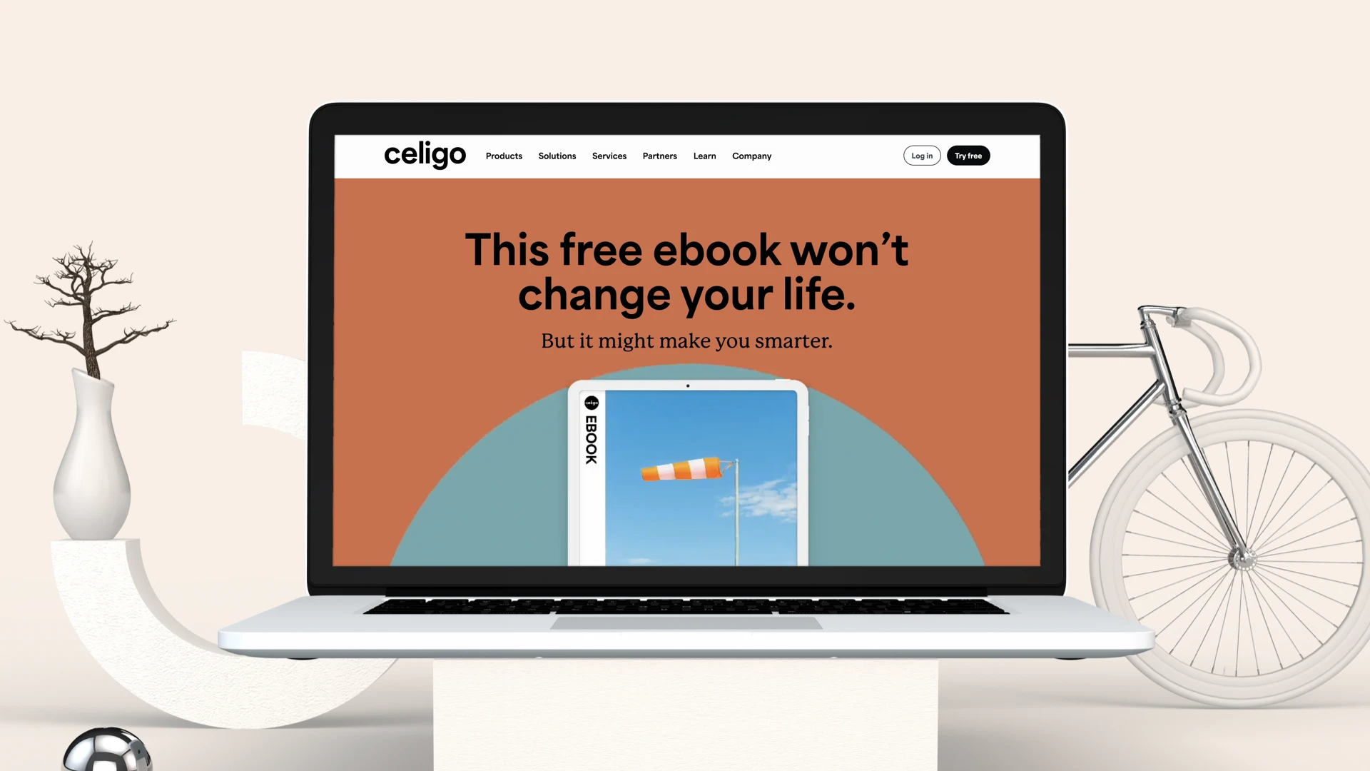
The final brand system combines bold geometric precision with humanist warmth, featuring dynamic motion graphics, authentic photography, and a scalable design architecture that enabled rapid implementation across 100+ touchpoints.
I developed the complete visual system internally, abandoning typical SaaS aesthetics in favor of bold differentiation. Area Normal (geometric sans-serif) paired with P22 Mackinac Pro (humanist serif) created flexibility for any communication context, from technical documentation to personal CEO messages. Our photography captured authentic human moments in our signature "The Day is Ours" style, eliminating generic stock imagery. Motion graphics evolved the legacy "Morse" system into dynamic shapes representing data connectivity. Bridging the gap between brand and product teams, a comprehensive design system in Figma provided scalable, flexible components ready for both marketing and product implementation, enabling the Product Design team to adopt and extend the brand seamlessly. Key learnings: Patience creates velocity (the year I spent building systems made execution exponentially faster). Strategic clarity beats volume (one comprehensive presentation beat months of iteration). Empowerment scales better than control (teaching strategic thinking enabled autonomous problem-solving). Business impact matters more than creative perfection (the rebrand succeeded because it supported revenue goals, not just because it looked good).

Achievements
"I've been a CMO for a long time and I've seen countless brand presentations in my career. This is the first time I haven't had a single change request. You've absolutely nailed it. Mic drop moment."
— James Whitemore, former Celigo CMO and current CMO at indeed
Leading the rebrand internally for this $100M ARR company, I delivered agency-level work that earned industry recognition (GDUSA Award, Gold ADDY), achieved $500K+ in cost savings, and supported Celigo in meeting aggressive growth targets while accelerating enterprise market positioning.
The rebrand delivered substantial business impact: Celigo met and exceeded aggressive ARR growth targets following the launch, with a strengthened enterprise deal pipeline and improved market positioning that supported the company's strategic shift toward larger accounts. From an operational perspective, the project demonstrated the power of strategic efficiency and lean execution. By driving agency-equivalent work internally with our small team, we delivered over $500K in cost savings while compressing a typical 9-12 month rebrand cycle into less than 5 months from concept to public launch, all while maintaining 100% of day-to-day creative operations. The design system foundation I'd built during year one proved instrumental, enabling the Product Design team to fast-track platform updates and adopt the new brand seamlessly. Internally, the response from our 700+ global employees was overwhelmingly positive, with feedback like "This is the Celigo I want to work for" validating that the brand finally matched the organization's ambition and forward trajectory.
Team Output Increase
Total Cost Savings


